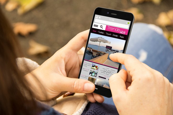
In today’s digital age, the reality is, your web visitor is more likely to explore your website on a mobile device than on a traditional desktop computer. In fact, 77% of adults are avid smartphone users and use their devices to surf the internet. That number increases to 80% when you factor in other mobile devices like laptops and tablets. If you have not put attention into what your website looks like on these mobile devices and how your interactivity functions on these platforms, then you could be doing a disservice to your company. Most websites, traditionally, were designed with the wider desktop computer view in mind. This works well if your web visitors are using a desktop or laptop to access your website. However, your website could appear distorted, load slowly or not work altogether on a mobile device using a mobile browser.
Mobile responsive websites feature the standard desktop view, but also have a size-modified version for mobile devices. This way you can rest assured that your new and returning customers are experiencing your website in the highest functionality possible. But, beware… not all websites can easily be converted to a mobile responsive format. Many contemporary website templates offer a mobile responsive version that can tailor your website to a mobile device view. However, consideration should be paid to text layouts, font sizes, colors and placement of tabs. For example, a standard web page, when viewed on a computer, may have paragraphs of text, that when put into a mobile view would cause the entire screen to be overrun with text. In this case, you would want to modify your existing webpage, by reducing some of the text, so that it appears more visually appealing on the mobile version.
It is important to note that it may be more cost- and time-effective to redo your website completely if your original website was not created with mobile responsiveness in mind. The key is to make sure your mobile web visitors can experience your brand and access the same information that desktop computers can see.
Examining your load time is also critical for mobile device users. Since the website will have to load using the mobile device’s network, you want to reduce any “load slowing” features or animations. If your load time is too long, mobile users may see “failure to load” messages which will likely decrease the chances that they can reach your website. Whenever you work with a web design developer, it is especially important to review your new site on as many platforms and devices as possible. You want to ensure that your web visitors, no matter if they’re using an Android tablet, an iPad, or a Lenovo laptop can both access and navigate through your website.
If you suspect that your website does not have a mobile responsive design, or if you want to give your website a 21st century facelift, contact our experienced design team for a free consultation. At, Snowball Creative Group, we specialize in creating award-winning and professional websites that are both impressive and user-friendly on all mobile devices.

