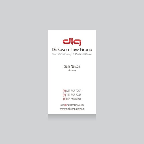
In today’s digital age, the focus has inevitably shifted to a company’s website and their online presence. However, traditional marketing collateral like business cards and flyers must also be up-to-date and eye-catching. Whether you attend a networking event, present at a conference, or interact with potential clients, you want to be sure your business card is something you are both proud to hand out and that accurately represents your company.
Graphic design specialists recommend reviewing your business card design and layout at least once every 12-18 months. This enables you to make changes to your card and update it with a fresh new look that can help your card stand out from the crowd.
Here are the top 3 things to review for your next business card audit.
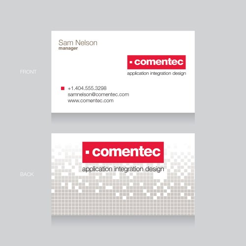
The amount of text. Traditionally, business cards included your name, your title, your office address, your email address, and phone number. However, as communications shift to often be entirely online, you should consider removing any extra text that is not necessary. Unless your office address is mission critical information for your clients, remove it from your card. In addition, adding your social media handles can be a great way to encourage prospective clients to connect with you online.
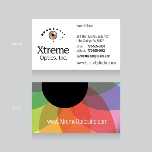
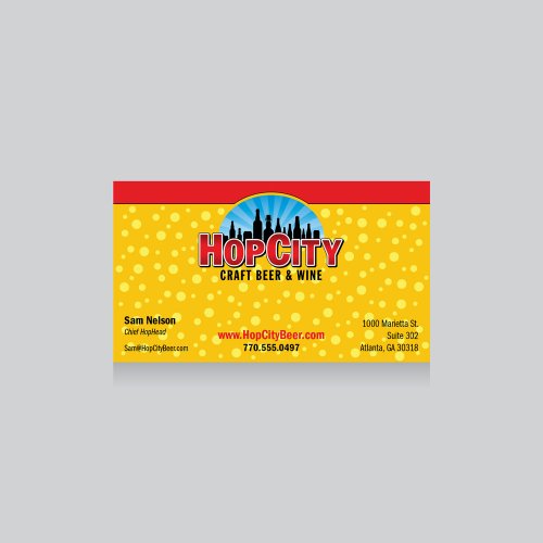
The colors and design. Have you changed your company logo or colors, but never updated this on your business cards? Then now is the time to do so. You want your brand to be consistent on all platforms that clients may come into contact with. That means, your website, your marketing collateral, and your social media page banners should all have a consistent look and feel. All too often, designs change on websites and social media accounts, but these design updates are never incorporated on business cards. You want clients to immediately be able to recognize your brand when they see your card in their wallet or in a Rolodex.
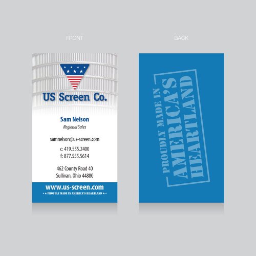
The quality of your print. As technology has evolved, so too has the visual quality of business cards. When you keep cards over time, print can fade and make the card look recognizably old. Are the colors and type on the cards clear? If the answer is no, then it is time to get them at least reprinted, if not redesigned altogether. Asking for a few variations of your business card design can also be a great way to have future designs already planned out. Some companies even go a step further to segment their market, by offering slightly different business card versions depending on the audience. For example, the front of each card may have the same design, but the back of your business card may be different depending on if you are giving it to a vendor, a potential business partner, or a customer. When you partner with an experienced graphic designer, they will be able to provide you with additional insight to create new and improved business card designs.
If you wouldn’t want your target audience to think your website looks outdated, then you also wouldn't want them to say the same thing about your business cards. Investing the time and effort to keep all of your marketing collateral fresh and updated, shows your prospective clients that you are serious about what you do. If you have not reviewed your business card layout and design in the past 6 months, email our award-winning graphic design team will be happy to send you a list of recommendations to help you truly stand out from the crowd.

